Jump to download and installation instructions »
What is Solarized?
 Solarized is a programming color “palette” designed by Ethan Schnoonover for use when writing syntax-highlited code. It’s based on color wheel and lightness relationships and it’s all sciencey and stuff, but the essence is that all the colors look good together and have good contrast, so you can use the different colors for different parts of your code (functions, variables, strings etc.) and no matter how you organize it the result should be easy on the eyes. It also has both a “dark” and “light” mode with different background/foreground colors, but most of the colors (red, green, magenta) work the same for both, which is cool.
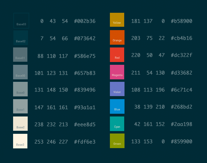
Here’s a color reference I put together showing the various colors in Solarized Dark along with their RGB and hex codes. It was very useful to have around while working on the NetBeans theme (the Solarized site is strangely lacking a similar reference).
My Solarized Dark theme for NetBeans+PHP
As soon as I heard about Solarized I wanted to try it out with NetBeans, my IDE of choice for PHP/WordPress coding. I’ve spent many an hour tweaking my color schemes in NetBeans (and Smultron, my old text editor before that) and choosing the color relationships was always the hardest part, so having classy choices all laid out for me was very appealing.
The good news was that there is already a NetBeans port of the Solarized colors that worked as advertised. The problem was that IMHO it wasn’t particularly well executed. NetBeans has a lot of options in the color scheme settings, but they are also extremely confusing and often flat-out misleading, so I don’t blame the original author for not getting it perfect. He also may not have been looking at PHP code, in which case it makes sense that the PHP-specific color settings weren’t well organized. Lastly there’s a huge element of personal taste, even within the process of implementing a preset color theme like Solarized, so I recognize that the result is really just my personal opinion of what NetBeans+PHP+Solarized should look like.
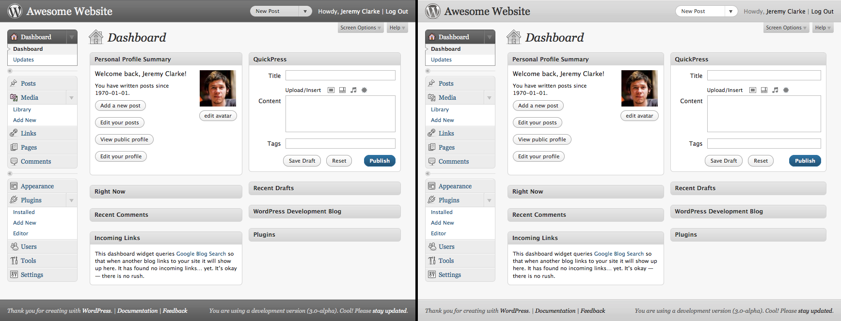
All that said, here’s a screenshot of my NetBeans Solarized Dark theme:

I like to think it balances the need to have different parts of the code be different colors and the limitations of doing so using the NetBeans color settings. It should work just as well with procedural and object-oriented code.
One feature I added that isn’t in the original Solarized for Netbeans colors is SVN support. I had to invent them, but my theme has appropriate red, green and blue background colors when viewing a SVN DIFF.
Installing my theme in your NetBeans
Since NetBeans has a configuration import/export system you can install these colors really easily.
- Download the .zip file linked below (don’t unzip it, NetBeans wants it as .zip).
- Open NetBeans and summon the Preferences window (Options on Windows).
- Go to the Fonts & Colors Preference tab.
- Click Import at the bottom of the window.
- Click Browse and find the .zip file, click OK.
Download netbeans-colors-solarized-dark-jer.zip »
Once you have the theme installed it should show up in the Fonts & Colors preferences as part of the Profile pulldown menu, where it’s identified as Netbeans_Solarized_Dark-jer.
Since I started using this I pretty much never feel the need to use a “light” theme so I haven’t tweaked the Solarized Light colors at all. Sorry if that’s what you would have preferred ;)
Anyway, hope some of you find this useful! I plan to someday get some of my changes added to the official GitHub repo, but wanted to get this out before my Code Faster and Smarter PHP with IDEs Like NetBeans talk tomorrow at WordCamp Montreal.


